We All Follow United
·24 June 2021
The story and the meaning behind the Manchester United crest over the years
We All Follow United
·24 June 2021
Manchester United are one of the biggest establishments in sports history and their crest and logo have played a big part in their marketing. Founded in 1878 by Newton Heath LYR Football Club by Yorkshire and Lancashire Railway, the club has come a long way to become a household name across the entire globe. There is a very high chance that no matter where you are, if you show someone the crest of Manchester United, they would recognize the team.
Like most logos, it has gone through various changes and modifications over the years to take the form of the crest we now see on the Manchester United kits. Here, we take you on a brief journey that traces the 120-year-long evolution of United’s crest.

Founded as Newton Heath, the name Manchester United was not anywhere in sight by then. The club’s first club crest, which dated back to 1878, saw the iconic yellow and green colours on it. Now you know why the two colours are still synonymous with the club despite the adoption of Red, Black, and White by the club over the years. The logo was a simple coat of arms with the club name written on it and a locomotive engine to showcase the club’s founders.
The club was still known as Newton Heath by this time. The logo was simplified to remove the train and a football logo was included at the top. The club name and the year of origin were included. This lasted until 1902, when the club underwent an iconic change in ownership.

Owing to debt in 1902, the club had to undergo a change in ownership. Four businessmen agreed to invest £500 each for a stake in running the club, and thus, a new name was born- Newton Heath was now Manchester United. This change warranted a new club logo. This logo was elaborate and defined a lot of elements entrenched in the city of Manchester.
The globe at the top indicated Manchester’s dominance in world trade. The merchant ship, which has now become an iconic part of the club’s crest, was included for the first time. The lion with a fortified helmet signifies the origins of the city around a Roman hamlet while the three yellow stripes indicate the three rivers- Irwell, Irk, and Medlock. It also contained the city’s motto ‘Concilio et Labore’, which means ‘wisdom and effort’.

The crest in 1960 was perhaps the first crest that beared resemblance to the one we see today in its shape and colour-scheme. While it did not have the yellow colour, that logo featured the ship, the three stripes, the coat of arms held up by the Lancashire rose, as well as the simple wordings, ‘Manchester United Football Club’.

A predecessor to this club’s crest was the one seen around the Munich air disaster in 1958, which was the crest that featured on the Manchester United kits during the big occasions. That logo can be seen above and had less than 2 years’ history.

The fifth logo was slight modification on the ones we saw before. It contained the colour yellow for the first time in the current template and the Lancashire rose was replaced by two footballs. The ship and the three stripes remained.

The sixth crest finally saw the induction of the ‘Red Devil’, a nickname that had become popular for the club under the legendary Matt Busby. It was meant to be intimidating for the opponents more than anything, and that has arguably worked in the following decades. The three stripes, however, were removed and did not come back since then.

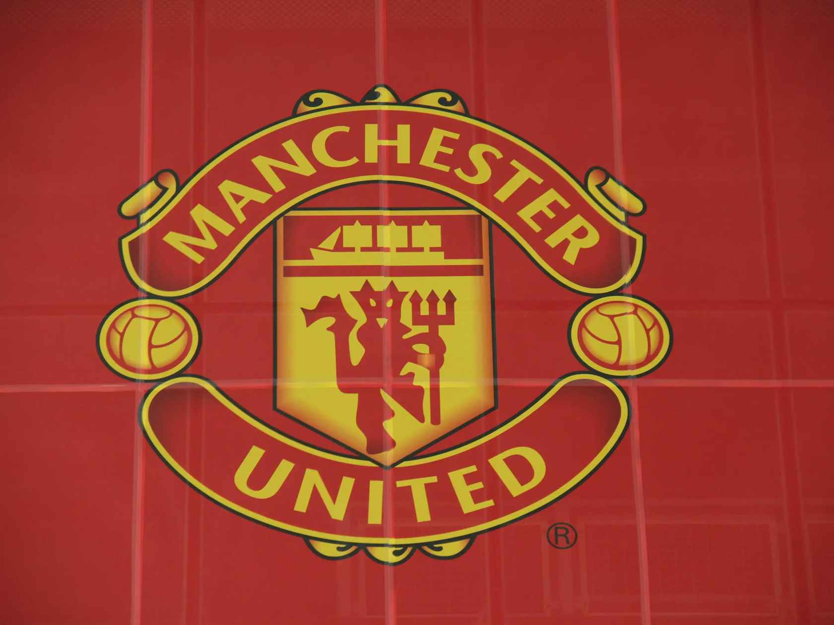
This is the logo that we now see on the club kits. It is essentially the same one as the 1973 edition but with slight modifications and refinement to give it a modern look. The logo has essentially gone unchanged in the past 23 years. Unlike other clubs that have gone for simplified logos in search of better marketing prospects, such as Inter Milan or the noisy neighbours, United’s crest is entrenched with history and legacy. And for this reason, it is hard to imagine it being changed anytime soon.